IDREFs: What they are and how to use them
by Kilian Valkhof published on
Take the following HTML for example:
<label>
  Email address
  <input type="email" />
</label>
Here, the <label> element is associated with the <input> element because the input is nested inside of the label, and the browser now knows to offer additional behavior: when the user clicks on the label, the input will be focused. That's not behavior that you had to specify with an onclick handler, the browser just infers it from the relationship between the elements.
But what if it can't infer the relationship? While your Firefox, Chrome or Polypane browser can all figure this out, some assistive technologies can't. Both Dragon Naturally Speaking and VoiceOver on macOS have trouble associating labels with inputs when they are nested, according to a11ysupport tests. So while clicking the label will focus the input, giving the voice command "Focus Email address" might not work. That said, support might have improved since the tests were last conducted: My editor Zoë tested this in Safari 26.0.1 on macOS 15.7.1 where it now works. Make sure to test before relying on this behavior!
Additionally, this association only works when the input is nested inside the label. If you wanted to have the label and input be siblings, for example for styling purposes, then that implicit association is lost.
To solve this, we can use the IDREF you probably already know, the for attribute on the <label> element:
<label for="email-input"> Email address </label>
<input type="email" id="email-input" />
Now we're explicitly associating the label with the input, by referencing the input's id from the label's for attribute. That's all an IDREF really is: a reference to another element's id.
Note, there's also nothing keeping you from using the for attribute and nesting both at the same time:
<label for="email-input">
  Email address
  <input type="email" id="email-input" />
</label>
Now you know what an IDREF is! In HTML there are many other places where you can use IDREFs to create explicit relationships between elements, many of which are ARIA attributes that help with accessibility and with describing more complex relationships than HTML can express. We'll get to those in a bit, because there's more to be said about IDREFs themselves.
IDs need to be unique
In a well-structured HTML document, each id is only used once. This is important for IDREFs to work properly, since the browser or assistive technology needs to be able to find the single right element when following an IDREF. If there are multiple elements with the same id, this can lead to unexpected behavior.
Making sure IDs are unique can be tricky: you might have multiple forms on a page that reuse the same naming, or another repeated structure that requires ARIA attributes. When that happens, consider a programmatic way to generate unique IDs, for example by prefixing them with the component name.
IDs need to exist
This might seem obvious, but the majority of issues that occur around IDREFs is that the referenced ID simply doesn't exist in the document. This can happen when you make a typo in the id or IDREF, or when you remove an element but forget to update the references to it.
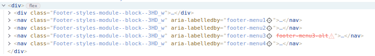
Linters and validators can help catch these issues, as can browser developer tools that highlight broken references. In Polypane, for example, broken IDREFs are highlighted in the Element panel, making it easy to spot and fix them.
In other browsers you can check for missing IDs using this little console snippet that gathers all for attributes on labels and checks if the referenced ID exists:
document.querySelectorAll("[for]").forEach((label) => {
  const id = label.getAttribute("for");
  if (!document.getElementById(id)) {
    console.error(
      `Label with for="${id}" has no matching element with that ID.`,
      label
    );
  }
});
Other HTML IDREF attributes
HTML has quite a few attributes that use IDREFs to create relationships between elements, including some very new ones.
The for attribute on <label> elements
As we've seen above.
A neat trick that for has: you can link as many labels as you want to a single input:
<label for="email-input"> Email address </label>
<input type="email" id="email-input" />
<label for="email-input"> required </label>
These will all focus the same input, and their combinined text will be used as the accessible name for the input: Email address required. Of course, that's the theory. In practice, support for inputs with multiple labels is inconsistent. Some assistive technologies will use all labels but some only use the first or the last one (see this research done by Deque). So while it's valid HTML, you're better off sticking to a single label per input for now.
The form attribute on form-associated elements
You can add a form attribute to form-associated elements like <input>, <button>, <select>, <fieldset> and <textarea> to associate them with a specific <form> element on your page, even if they are not nested inside that form:
<form id="signup-form">...</form>

<button form="signup-form">Sign up</button>
Something to keep in mind is that the form atttribute only works for the current element, not its children. If you have a <fieldset> with a form attribute, the inputs inside it will not be associated with the form unless they also have a form attribute.
Another thing to keep in mind is that you can remove an element from a form by giving it a form attribute that points to a different form, or to no form at all (by giving it an empty string). Here's an example from MDN:
<form id="externalForm"></form>
<form id="internalForm">
  <label for="username">Username:</label>
  <input form="externalForm" type="text" name="username" id="username" />
</form>
Even though the label will focus that input, the input will be submitted with externalForm and not for internalForm.
Like the advice for labels, keeping form-associated elements inside their forms is generally easier to manage. The above might be useful design-wise when you have a wizard across multiple steps that each have their own form, but you want a submit button that's always visible across the steps.
The list attribute on <input> elements
If you have an <input> element, you can use the list attribute to associate it with a <datalist> element that contains predefined options for that input to have it show a dropdown and autocomplete with those options:
<input list="browsers" name="browser-choice" id="browser-choice" />
<datalist id="browsers">
  <option value="Chrome"></option>
  <option value="Firefox"></option>
  <option value="Safari"></option>
  <option value="Polypane"></option>
</datalist>
This works on desktop browsers, but you should not depend on it: mobile browsers often don't show the datalist options at all, and assistive technologies may not announce them either. So while it's a nice enhancement, make sure your form works well without it too.
The headers attribute on <td> and <th> elements
When you have complex tables where header cells might have subheaders, you can use the headers attribute on data cells (<td>) and header cells (<th>) to explicitly associate them with the relevant header cells:
<table>
  <tr>
    <th id="name" colspan="2">Name</th>
  </tr>
  <tr>
    <th id="first">First</th>
    <th id="last">Last</th>
  </tr>
  <tr>
    <td headers="first name">Kilian</td>
    <td headers="last name">Valkhof</td>
  </tr>
</table>
And here we also introduce the concept of multiple IDREFs in a single attribute. Some IDREF attributes can reference multiple IDs by separating them with spaces. In this case, the first data cell is associated with both the "First" and "Name" headers. When browsers now announce the cell, they can include the text of both headers in the announcement.
New HTML IDREF attributes: popovertarget, commandfor, anchor and interestfor
HTML is in the process of getting several new functionalities that make it easier to create declarative interactive components like popups and tooltips. To help with those, new IDREF attributes are being added.
popovertarget can be added to a button to associate it with a popup element that has the popover attribute. That way the popover is shown when the button is activated. For a more in-depth explanation, check out PSA: Stop using the title attribute as tooltip! from last year's advent calendar.
The default action for popovertarget is to toggle the popover when the button is activated, but you can use the popovertargetaction attribute to change that behavior. The default value is toggle, but you can also set it to show or hide to always show or hide the popover when the button is activated.
<button popovertarget="my-popover" popovertargetaction="show">
  Show popover
</button>

<div id="my-popover" popover>
  This is a popover!
  <button popovertarget="my-popover" popovertargetaction="hide">Close</button>
</div>
commandfor does the same as popovertarget, but can also be used to open and close <dialog> elements declaratively with show-modal and close as command values.
<button commandfor="my-dialog" command="show-modal">Open dialog</button>

<dialog id="my-dialog">
  This is a dialog!
  <button commandfor="my-dialog" command="close">Close</button>
</dialog>
Lastly, interestfor is similar to commandfor, but is used when a user "expresses interest" in an element, for example by hovering over it or focusing it. The use case here is to show tooltips or hint popovers when the user hovers or focuses an element.
<button interestfor="my-tooltip">I'm a button!</button>

<div id="my-tooltip" popover="hint">The button does nothing.</div>
For more on interestfor, check out the OpenUI explainer on interest invokers.
popovertarget works in all browsers, while commandfor is still lacking support in Safari. interestfor is still very new and only supported in Chromium 142 and newer.
To learn more about these, keep an eye on upcoming articles in this advent calendar!
Lastly, the anchor attribute will let you declaratively specify which element a popover or tooltip should be anchored to. Currently this is something you have to specify with CSS, but it can be much easier to reference an ID instead. Unfortunately it's not supported yet.
ARIA IDREF attributes
All of which brings us to ARIA. ARIA is a set of attributes designed to add semantics, relationships and behaviors to HTML where the native elements and attributes fall short. They're not the first thing you should reach for, but there are many things where HTML alone can't express what you need.
Many ARIA attributes are IDREF attributes that allow you to create explicit relationships between elements.
Descriptive relationships
A common use case for ARIA is to make sure that elements have an accessible name and/or description. Often you'll see this done with aria-label:
<button aria-label="Move to trash">
  <span aria-hidden="true" class="icon">🗑</span>
</button>
This works, but aria-label comes with some downsides. For example, it's easy to miss: a common issue accessibility auditors find is that a button's HTML is copied for another purpose, but the original aria-label is not updated to reflect the new purpose. Browsers also have issues with automatic translations of aria-labels, since they are not part of the visible text on the page.
<button aria-label="Move to trash">
  <!-- oops! -->
  <span aria-hidden="true">🔃 Revert</span>
</button>
It is often better to use aria-labelledby to give an element its accessible name. aria-labelledby gives elements an accessible name by referencing other elements that contain the relevant text. Indeed, aria-labelledby can reference multiple IDs, allowing you to combine text from different elements into a single accessible name:
<div class="photo">
  <button aria-labelledby="trash-label photo-label">
    <span aria-hidden="true" class="icon">🗑</span>
    <span id="trash-label" class="visually-hidden">Delete</span>
  </button>
  <span id="photo-label">IMG_0512.jpg</span>
  <img src="IMG_0512.jpg" alt="Sydney Opera House at sunset" />
</div>
The above button's accessible name will be "Delete IMG_0512.jpg", combining the text from both referenced elements and making it clear that the button deletes, and which photo it deletes.
Sometimes elements might have an accessible name, but you still want to have an additional description to give more info. Visually that is easy to do, think of the word "required" below an <input> element. That association is not always clear to assistive technologies. To make that association explicit, you can use aria-describedby and reference IDs of elements that contains the description.
Again, MDN gives us a nice example:
<button aria-describedby="trash-desc">Move to trash</button>
<p id="trash-desc">
  Items in the trash will be permanently removed after 30 days.
</p>
The button's accessible name "Move to trash" is understandable on its own, but the description provides additional context about what happens when you move something to the trash.
Complex relationships
ARIA also has many attributes that help express more complex relationships between elements: aria-controls, aria-owns, aria-activedescendant and aria-flowto.
aria-controls is used to indicate that an element controls another element, for example a button that shows or hides a section of content. This can help assistive technologies understand the relationship between the button and the content it controls:
<button aria-controls="submenu" aria-expaned="false">Open menu</button>
<nav id="submenu" hidden>...</nav>
Here, the button is indicating that it controls the visibility of the nav element with the ID submenu. You can then combine this with aria-expanded on the button to indicate whether the submenu is currently visible or hidden.
To account for even more complex structures, aria-controls can also reference multiple IDs, allowing a single control to manage several elements at once.
aria-activedescendant is used to indicate which element within a composite widget is currently active. An example of a composite widget is a combobox: a UI component that combines a text input with a list of options: You can type in the text input to filter the options, fill in freeform content or use the arrow keys to navigate the options. For a reference implementation look at the combobox in the WAI-ARIA Authoring Practices. Getting a combobox right is tricky, so make sure to read that guide if you're building one!
You can use aria-activedescendant (in combination with aria-controls) on the input to indicate which option in the listbox is currently selected:
<input
  type="text"
  role="combobox"
  aria-autocomplete="list"
  aria-haspopup="listbox"
  aria-expanded="false"
  aria-controls="options-list"

  aria-activedescendant="option-2"
/>
<ul id="options-list" role="listbox" aria-label="options">
  <li id="option-1" role="option">Option 1</li>
  <li id="option-2" role="option">Option 2</li>
  <li id="option-3" role="option">Option 3</li>
</ul>
aria-owns is used to create a parent-child relationship between elements that are not nested in the DOM. When for some reason your DOM can't be structured in a way that makes sense visually or semantically (for example, you need to use a "portal" in some Javascript frameworks),aria-owns will let you "rewrite" the accessibility tree as if the elements were nested. Any elements that are inside the element are listed first, and then the elements you refernece in aria-owns are added as children after that.
Keep in mind that when you use aria-owns, all the regular rules about HTML still apply: You can't nest an interactive element inside another interactive element, and some elements can only have specific types of children. Because of this, giving a specific example for aria-owns will always feel a little contrived. I'm going to try anyway.
Here's how you would structure a combobox where the list of options needs to be elsewhere in the DOM, for example to break out of a container with overflow:hidden:
<label for="combobox-input">Choose an option:</label>
<div aria-owns="floating-list">
  <input
    id="combobox-input"
    type="text"
    role="combobox"
    aria-autocomplete="list"
    aria-haspopup="listbox"
    aria-expanded="false"
    aria-controls="floating-list"
    aria-activedescendant=""
  />
</div>

<!-- elsewhere in the dom to avoid stacking context clipping -->
<ul id="floating-list" role="listbox" aria-label="options">
  <li role="option" id="option-1">Option 1</li>
  <li role="option" id="option-2">Option 2</li>
  <li role="option" id="option-3">Option 3</li>
</ul>
Note that we use both aria-controls and aria-owns here. aria-controls indicates that the div controls the listbox, while aria-owns indicates that the listbox should be a child of the div in the accessibility tree. aria-owns describes a structural relationship, while aria-controls describes a functional relationship.
aria-owns on its own doesn't change the browser's default behavior, where the tab order follows the DOM structure. Assistive technologies can instead use the aria-flowto relationships to offer the user a way to navigate content in the suggested order.
In other words, aria-flowto is used to indicate a logical reading order between elements that doesn't follow the visual ordering of elements. That can happen when they're in different places in the DOM, or when you've changed the visual order with the order CSS property, or by absolute positioning elements. Using aria-flowto can help assistive technologies navigate the content in a way that makes sense.
aria-flowto can also reference multiple IDs. In that case, the assistive technology can give the user a choice of which element to navigate to next.
As with all things ARIA, aria-flowto is a last resort: it's better to structure your HTML in a way that follows a logical reading order without needing to override it with ARIA. This is doubly true for aria-flowto because support in browsers and assistive technologies is limited: only the JAWS screen reader supports it at the moment.
Do you need ARIA IDREFs?
As you can see from the descriptions above, the ARIA attributes get increasingly more esoteric and complex. Things like aria-labelledby and aria-controls can be useful in many situations, but others like aria-owns and aria-flowto are only needed for specific use cases. When you think you need ARIA it's often better to take a step back and consider if you can achieve your goal with native HTML elements and attributes.
It's also important to note that none of these ARIA attributes bring any behavior on their own: they only describe relationships. This can help assistive technologies understand the structure of your page, but you'll still have to implement the actual behavior. For example, <button aria-expanded="false" aria-controls="my-menu"> will not automatically show and hide that menu element or move the focus into it. You have to implement the show/hide behavior and focus management. The ARIA attributes just tell the browser that this button controls that menu and whether it's expanded or not.
IDREFs and how to use them
IDREFs let you create explicit relationships between elements in your HTML where they otherwise might not exist. Some of them give you additional behaviors, like how the for attribute on a label makes clicking the label focus the input, or how the list attribute on an input shows a dropdown of options from a datalist.
Other IDREF attributes, especially in ARIA, are used to describe relationships that help assistive technologies understand the structure and purpose of your content better. If you also want those to show certain behaviors, it's your job to implement those.
Whenever you use IDREFs, make sure that the referenced IDs exists, and that you test their usage with the browsers and assistive technologies your users use.
About Kilian Valkhof
Web developer and creator of Polypane.app, the browser for developers.
Personal site: kilianvalkhof.com
Polypane: polypane.app
Comments
There are no comments yet.
Leave a comment