Do you know color-scheme?
by Sara published on
Do you know of color-scheme yet? If not, I bet you still think you do. It will certainly look familiar, as prefers-color-scheme has been around for longer and is clearly related.
You're in good company if it's new to you - the State of CSS 2022 results just came in, and 73% of respondents had never heard of it.
You probably use prefers-color-scheme a lot within your CSS media queries, to make a dark or light theme for your sites and apps based on user preference. Maybe you also add a toggle so people can choose their color scheme, irrespective of their OS settings. Beautiful. But now there's more to play with!
What is color-scheme, then?
It's a CSS property all of its own, and can save you a bunch of styling work for dark mode.
/* the selector here could be :root, html or body */
:root {
  color-scheme: light dark;
}
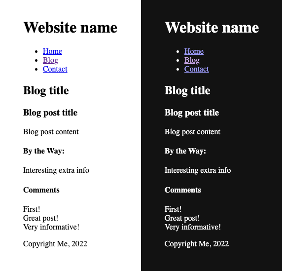
Stick the above inside your stylesheet or <style></style> tags and voila, your website, without any other styling, will now respond to the user's prefer-color-scheme preference, as can now often be specified in their OS settings. There are default colors set in the browser for bare HTML not only in light mode, but also in dark mode. Cool, right?

If you're like me, and tend to create little simpler sites - or if you make bigger ones with minimal styling, and you want to provide dark mode with as little extra faff as possible, you will want to explore using color-scheme. There's another bit of magic here - you don't even need to use it with a <style> tag, or .css file at all, if you don't want. You can get dark mode with HTML only.
Yep, just HTML. Without even touching your CSS. You can also place it inside the <head></head> as a meta tag:
<head>
  <meta name="color-scheme" content="light dark" />
</head>
The order of modes light dark or dark light can make a difference - a user with no preference set will see the first mode. However, given that already most current OS (mobile and computer) versions ask you if you want light or dark mode, or even a mode that changes from one to the other automatically over the day, this may soon become less effective.
Why do I want to use it?
Many websites leave a bunch of defaults as they are - usually light mode defaults. If they just want a white background then why declare that again? You can now do the same for dark mode.
Some will suggest that these colors should always be declared - but it really depends how minimal you want to be! Leave both the text and background as default, and they will both be controlled by the users themselves, via color-scheme.
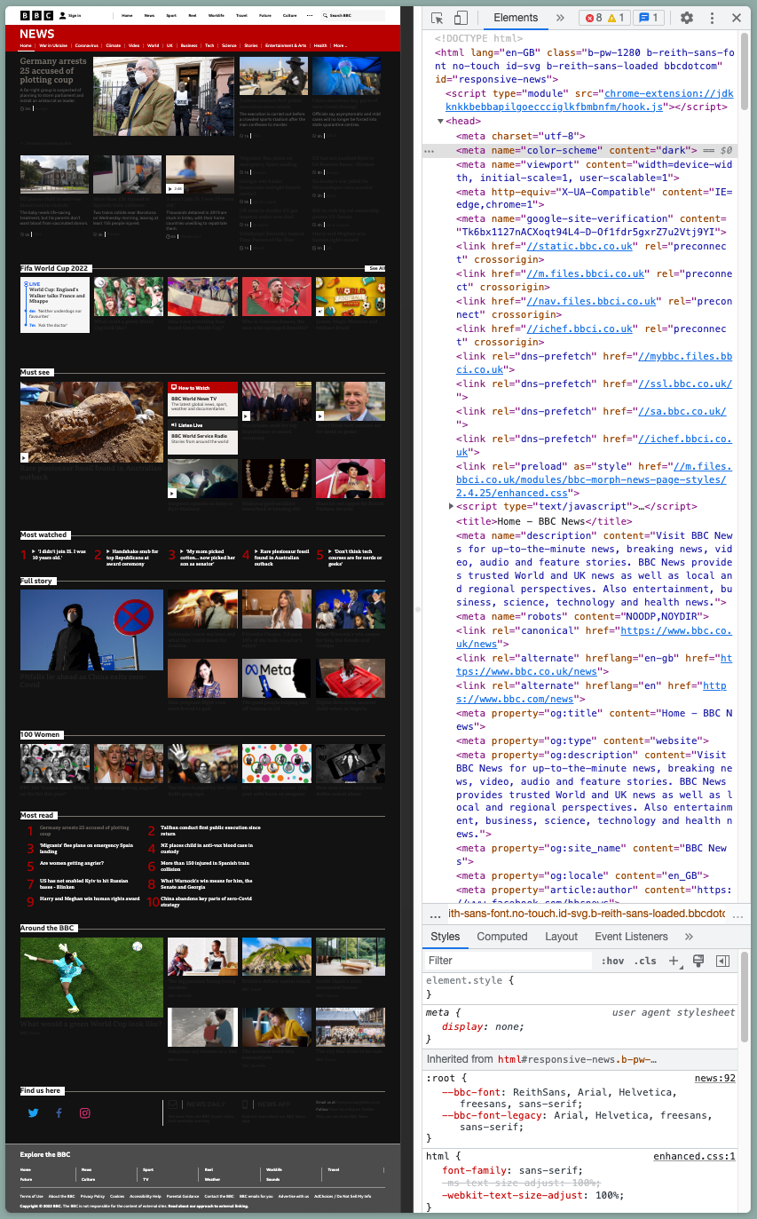
You can see when other non-dark-mode sites have stuck with browser default colors, by opening up dev tools on them, and pasting that meta tag with just dark into their HTML. The bits that flip in color from light to dark (and where text goes from dark to light) were using the defaults.
Here's an example of this happening on the BBC News website, after I added a meta tag to make the color-scheme dark:

Here you see they kept the main background default, but must have declared the text color - as the background darkens and renders the text almost invisible. In the "Most watched" and "Most read" sections, they've left both background and text default, and so they both flip.
How else can I use it?
Of course you can use JavaScript to manipulate the content of the meta tag.
<head>
  <meta name="color-scheme" content="light dark" />
</head>
function lightMode() {
document
.querySelector('meta[name="color-scheme"]')
.setAttribute("content", "light");
}
function darkMode() {
document
.querySelector('meta[name="color-scheme"]')
.setAttribute("content", "dark");
}Or just keep the property within a *.css file as with other CSS properties. The world's your oyster.
:root {
  color-scheme: light dark;
}
It's really worth experimenting. You can add the CSS to :root, html, body, or indeed any other element, as maybe you only want parts of your site to do the flip (you might choose to keep the header and footer the same in both modes, as an example).
System colors
When targeting elements you will also need to declare at least the background-color, as most elements are by default transparent. You can do this with the system colors Canvas for the background and CanvasText for the default text color, as these both follow color-scheme.
There are more system colors! See them at the W3C: System Colors.
A few of them are a bit variable across browsers - notably LinkText in some browsers doesn't always have enough contrast with the dark background in dark mode. Canvas and CanvasText are however more reliable and very useful!
section {
  background-color: Canvas;
  color: CanvasText;
}
section.light {
  color-scheme: light;
}
section.dark {
  color-scheme: dark;
}
I've already styled everything for both modes.
Really, everything?
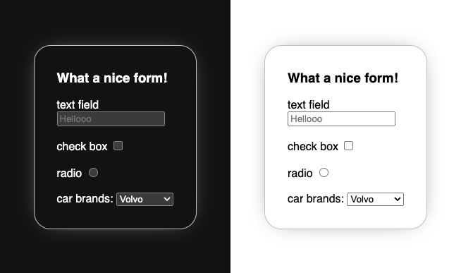
Know what else is great? color-scheme takes the default UI elements with it. The scroll bar, the select dropdowns, radio buttons and checkboxes - they all flip with color-scheme too, saving you all those little niggly UI styling jobs. Maybe you have already done this for your current project, but what about your next one?

Please feel free to fork and play with the Codepen.
Any other benefits?
If you're happy to forgo a mode toggle, and want to also save some CSS loading time? Put your dark mode and light mode styles into separate *.css files, and then use the prefers-color-scheme media queries in the <link> tags in your head to only load the relevant styles.
<link rel="stylesheet" href="layout.css" />
<link media="(prefers-color-scheme:light)" rel="stylesheet" href="light.css" />
<link media="(prefers-color-scheme:dark)" rel="stylesheet" href="dark.css" />
Once you start allowing scheme toggling outside of the user OS-set preference, trying to do this does of course get more complicated - I would only urge you to experiment!
Have fun with it! You can thank me later ;)
Further reading:
For some experimentation I did, feel free to check out https://color-scheme-light-dark.netlify.app/
Do check the dates on these! color-scheme is still relatively new, but it's much better supported than when a couple of these articles were written - but they remain good articles on the subject:
- Find out more about
color-schemeat https://web.dev/color-scheme/ by Thomas Steiner - Jim Nielsen wrote about both
color-schemeand system colors: https://blog.jim-nielsen.com/2021/css-system-colors/ - More on system colors from Stefan Judis: https://www.stefanjudis.com/today-i-learned/css-defines-color-values-that-follow-system-preferences/
Please ping me a message on Mastodon with any solutions you come up with that use color-scheme - I would love to see them!
About Sara
‐ a long time tech generalist (from PCB design to physics teacher to time-lapse video making) who has recently chosen to specialise in front end development.
Web-In-Progress: sarajoy.dev
Mastodon: @sarajw@front-end.social